Sant Dalmai
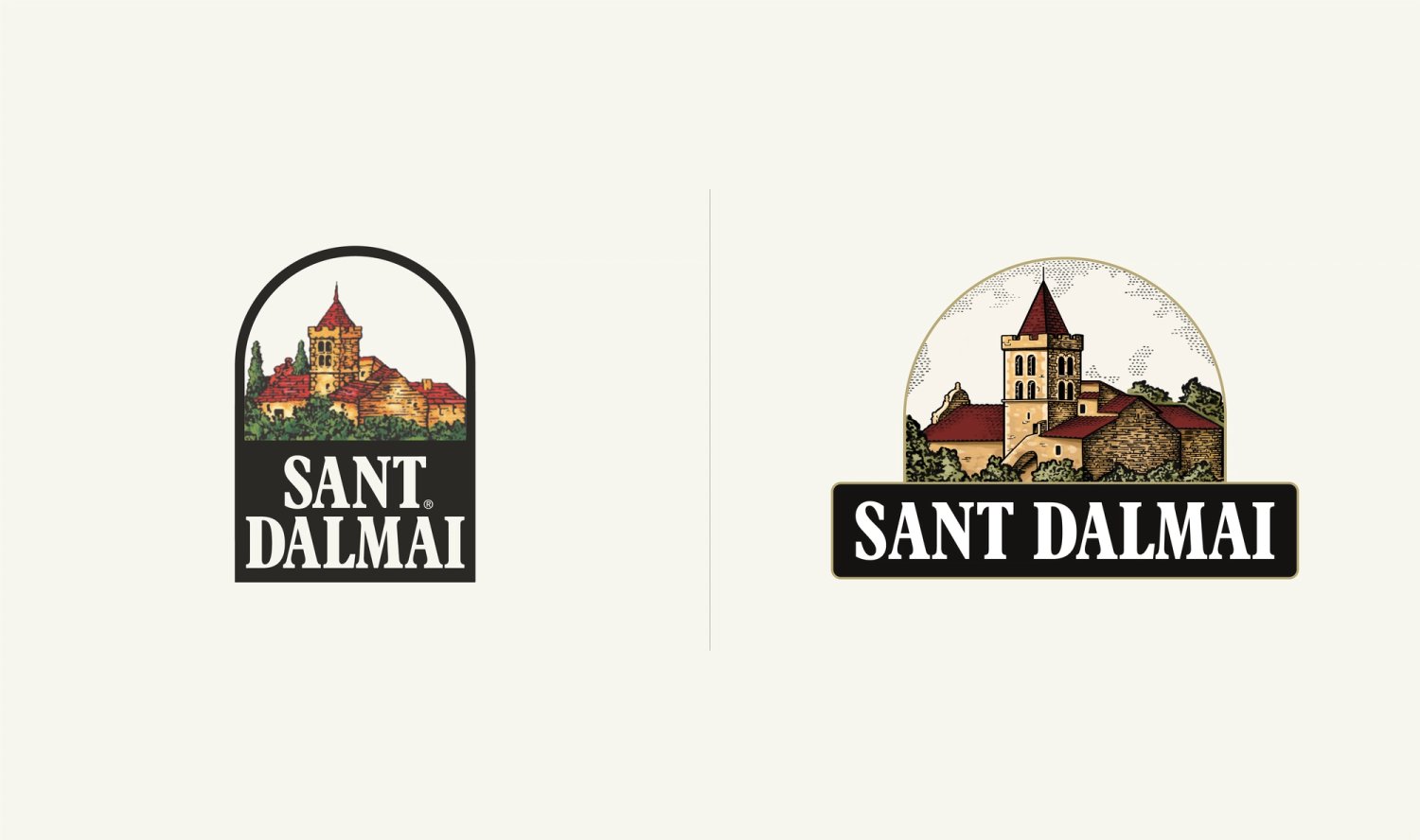
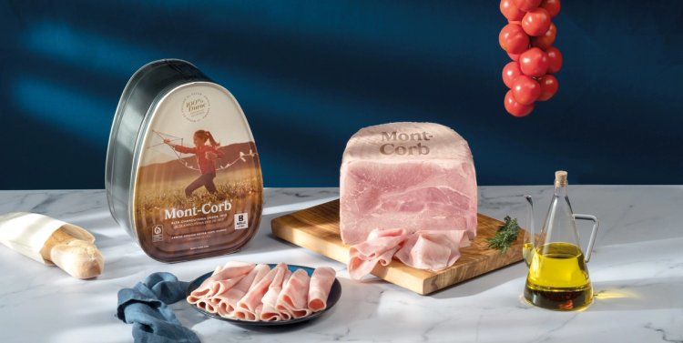
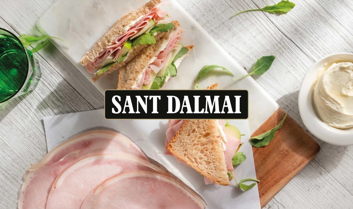
Logo redesign for Sant Dalmai, a charcuterie brand established in 1964. The new illustration and composition preserve the brand’s recognition and heritage while refreshing its visual identity and improving its flexibility across a wide range of applications.
Challenge
Sant Dalmai is a well-established brand in the charcuterie industry, with a highly recognisable identity that has become limited in meeting today’s communication needs. The challenge is to refresh the logo without losing the elements that have made it iconic, while preserving its connection to the brand’s history, tradition and product quality.
Solution
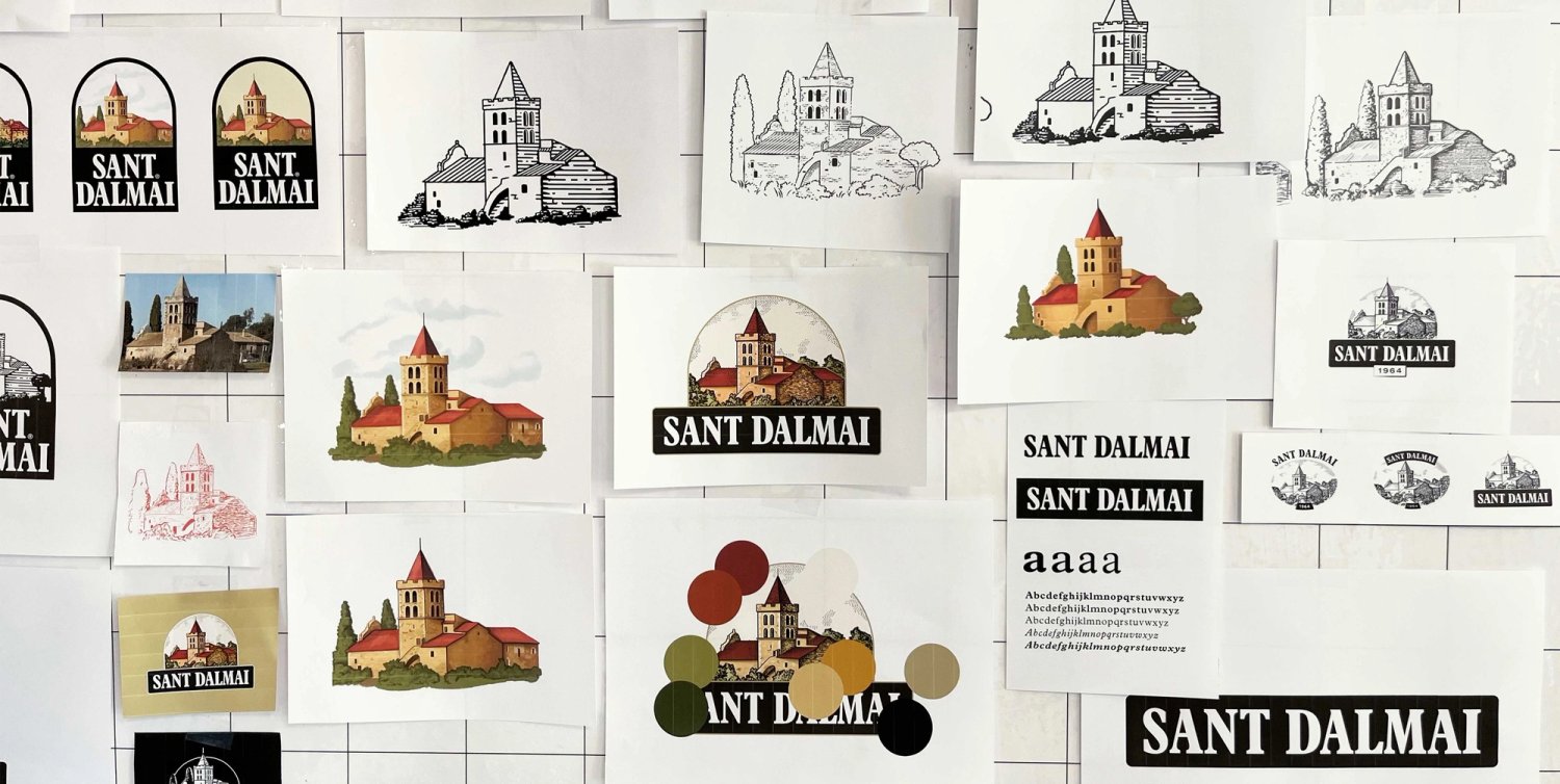
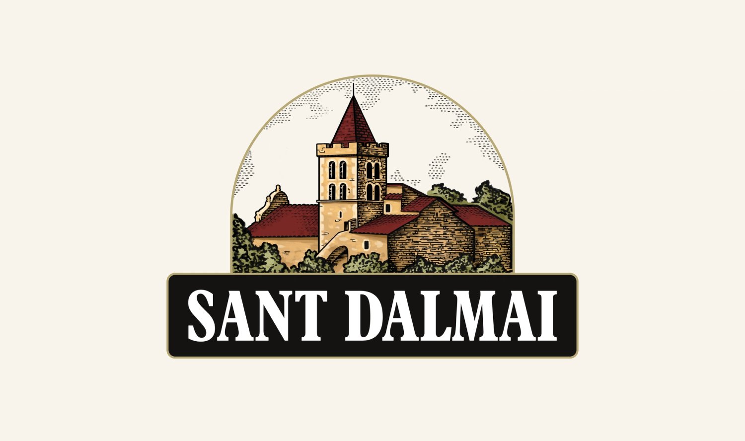
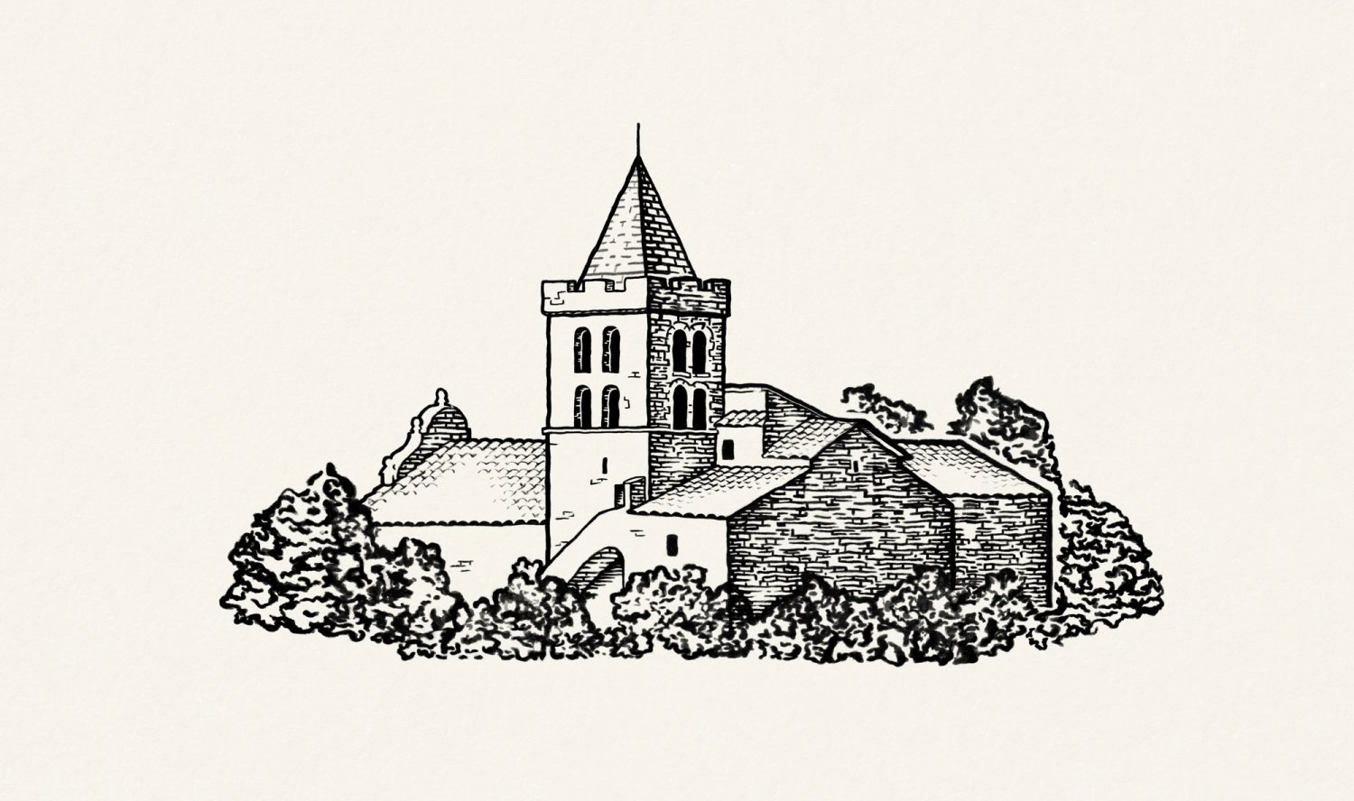
We evolved the logo while staying true to the essence of Sant Dalmai. We retained its signature arch —the brand’s most distinctive element—and rebalanced the composition so that both the symbol and the wordmark gain presence and legibility. The illustration was refined with a more defined line and a more realistic representation, while respecting the perspective of the building and its surroundings.
The new colour palette introduces warmer, earthier tones that reinforce a more natural and traditional perception of the product. The identity system is completed with a range of logo variations that ensure flexible application across different touchpoints, creating a visual identity ready to grow without losing sight of its heritage.